

Perspective in one SVG path: the floor of pablo.space
The checkered floor at the bottom of pablo.space is a single SVG path inside the CSS. What SVG is, why turning a PNG into one is hard, how dividing by distance makes the perspective, and the two masks that fade it into the page.
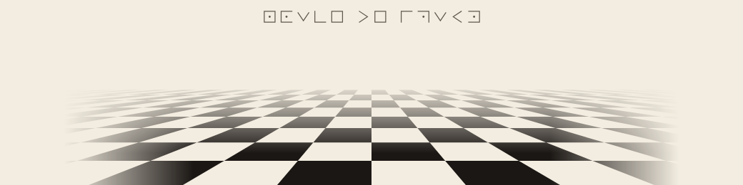
Scroll to the end of any page on pablo.space and there's a checkered floor, black and cream tiles running off toward a horizon between the two columns. I found the drawing online and converted it to SVG. What's on the site now is one SVG drawing embedded in the CSS, with no external image and no JavaScript.
This post is about the two things that make it work: what an SVG actually is, and the small bit of math that makes a flat pattern look like it goes into the distance.
Pixels and shapes #
A PNG or a JPG stores pixels. An SVG is a vector file: it describes how to draw the shapes. A circle in SVG is literally a line of text saying where the center is, how big the radius is and what color to fill it with. The browser draws it fresh at whatever size the screen needs, so it never gets blurry.
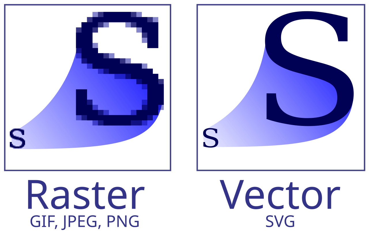
That's why converting a PNG to SVG is harder than it sounds. The program has to guess which shapes produced those pixels.
Think of a black circle on a white background. You glance at it and see a circle. The program gets a set of black pixels and, around the edge, a ring of grays that make it look smooth. It can recognize the geometry and write a single <circle>, or it can follow the outline pixel by pixel and produce a curve full of tiny wobbles. Both results can look the same at the original size. The difference shows up when you zoom in or try to edit the circle.
How hard it gets depends a lot on the image:
- A simple logo with flat colors usually vectorizes well, especially if the original is large and sharp.
- A signature or an ink drawing: the program can follow the silhouette, but a thin or blurry stroke may come out thicker, broken or crooked.
- A photograph: skin, hair, shadows and reflections have delicate transitions. With few shapes it looks like a poster. With thousands of them the SVG gets heavy and hard to edit.
There's also a trap. It's easy to put a PNG inside a .svg file. It opens normally and looks the same, but it's still pixels, and it still gets blocky when you zoom in.
So for a logo you want to edit and use at any size, it's often better to redraw the few shapes that matter than to ask a vectorizer to keep every irregularity of the PNG. A checkered floor is the friendly case: every tile has four straight sides, and the whole thing can be described with a handful of numbers.
Perspective is a division #
The rule that makes a floor look like it's moving away is simple: the size of something on screen is its real size divided by its distance. Call the distance z. The floor uses that rule twice.
The height of each row on screen:
y = horizon + (height - horizon) / zWith z = 1 the line falls on the bottom edge of the drawing. With z = 7 it climbs almost to the horizon.
The width of a tile:
width = 132 / zUp close a tile is 132 units wide. In the back row it's 19.
The rows sit at these distances:
7, 5.4, 4.2, 3.3, 2.6, 2.05, 1.62, 1.28, 1Each one is the next divided by about 1.28. Because the steps multiply instead of adding, the rows get thinner and thinner as they approach the horizon, which is exactly what a real floor does when you look across it.
Every tile is a trapezoid #
A tile sits between two rows. Its top edge uses the width of the farther row and its bottom edge uses the width of the nearer one, so the sides lean toward the middle on their own. The vanishing point is never drawn. It shows up as a consequence of the numbers.
This is one real tile from the file, the one just right of the center in the back row:
M800 16.3 H818.9 L824.4 22.9 H800 ZRead it like instructions for a pen. M moves to the top left corner at (800, 16.3). H draws a horizontal line to 818.9, so the top edge is 18.9 units wide, which is 132 divided by 7. L draws a slanted line down to (824.4, 22.9), the next row. H goes back to 800, and that bottom edge is 24.4 wide, 132 divided by 5.4. Z closes the shape. Four corners, and the slant comes for free.
The checkerboard comes from skipping. Only the dark tiles exist in the SVG, alternating from row to row. The "light" tiles are just the cream color of the page showing through. And every dark tile goes into a single <path>, one long string of those M, H, L, Z commands, which keeps the whole drawing at a few kilobytes.
The CSS places it and fades it #
The SVG goes into the CSS as a url("data:image/svg+xml,..."), the background of html::after. That's a 150px block the browser creates after all the other content on the page, which is why the floor only appears at the very end.
The fade is two masks crossed with mask-composite: intersect, so a pixel only shows where both masks let it through:
- a vertical one, going from transparent at the top to opaque at the bottom, so the far end of the floor dissolves into the paper;
- a horizontal one, which fades the sides out starting 250px from the center, so the floor doesn't run over the bases of the two columns.
mask-image:
linear-gradient(to bottom, transparent 4%, #000 70%),
linear-gradient(to right, transparent calc(50% - 430px), #000 calc(50% - 250px), #000 calc(50% + 250px), transparent calc(50% + 430px));
mask-composite: intersect;
That's all of it: a few numbers divided by a distance, one path, and two gradients. Go to the bottom of pablo.space and stand on it for a second.